eBook
A beginner’s guide to network analysis
How network graphs reveal the relationships that matter in your data.
One of the most valuable uses of AI is the ability to predict outcomes with better certainty. To get the most of this predictive power, it’s necessary to hone in on the relationships between people, objects, places, and events. Relationships are strong drivers of behavior. But the more complex these connections are, the more difficult it becomes to predict what’s coming accurately.
For example, an enterprise business with tens of thousands of employees that’s worried about talent retention has a lot to assess to determine who’s most likely to leave next, what options they have to keep them, or how to prepare for the churn. They may need to look at not just employee relationships with colleagues and managers but more abstract relationships. It might take a deep analysis of characteristics like gender, position within the company, tenure, type of degree, interests outside of work, the average number of years at previous companies, and other factors to understand the kinds of employees most likely to leave.
This is the sort of complexity that traditional business intelligence (BI) tools aren’t well suited to sort through because much of the data isn’t numerical. Pie charts and bar charts can’t account for the unique combination of values that represent each individual.
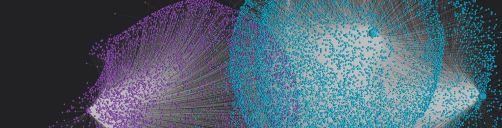
This is exactly the kind of challenge that network graphs can take on. Network graphs can expose millions of relationships as an interactive and understandable visual. They are the ideal way to visualize complex connections and surface those that may be otherwise hidden within your data. Ultimately, network graphs and AI can combine to make sense of a community of people, locations, objects, or cells, in ways that traditional BI simply can’t.
Here’s a primer on network graphs, including what they are, how businesses use them to make better sense of data, and what sets Virtualitics’ AI guided-exploration technology apart.
What are network graphs?
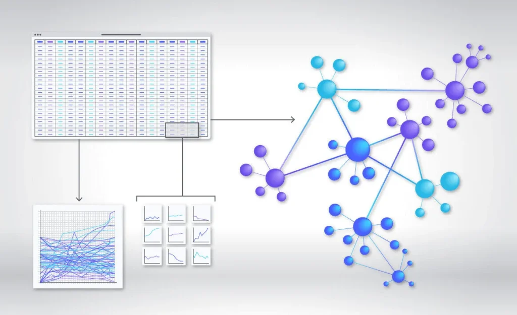
Network graphs are visualizations that capture the interconnected nature of complex data. These can be intangible relationships—like transactions between bank accounts, all the pages on the internet, professional connections on LinkedIn— or physical networks—the North American electric grid, airports, a transit system. These networks are made of nodes and edges. Nodes are the individual items/objects/people and edges represent the relationships between them.
In a network graph showing all lending associated with the International Monetary Fund, the nodes would be all borrowing member countries. The edges would be the connections between these borrowers (the loans themselves) and the IMF, which provides funds from its own quota resources.
This is a result of data that has been aggregated to the point that useful information is watered down. As an example, it’s common to replicate a BI dashboard to look at different business problems, to save time on setup. But this doesn’t allow for the specific context of the new problem. And the conclusions a dashboard “template” may offer up can lead to the wrong course of action. Many traditional BI vendors have lamented that when onboarding new customers, stakeholders have no idea what they want to show. They are further baffled by how to determine what to show.
The new era of analytics is more focused on mining and prospecting. With it comes a new toolset that is distinct from the dashboards that we all rely on. This new toolset uses AI for automation, efficiency, and guided exploration, allowing analysis to go much further than previously possible, way beyond simplification of data through aggregation.
The details and specificity of business decisions matter like never before. When a company loses sight of unique individuals, it risks following recommendations and taking business actions that make sense at a high level—but may fail when applied to individuals. Network analytics can now be leveraged to account for the relationships that live in data. Seeing how a decision for an individual could backfire through secondary effects is now a reality.
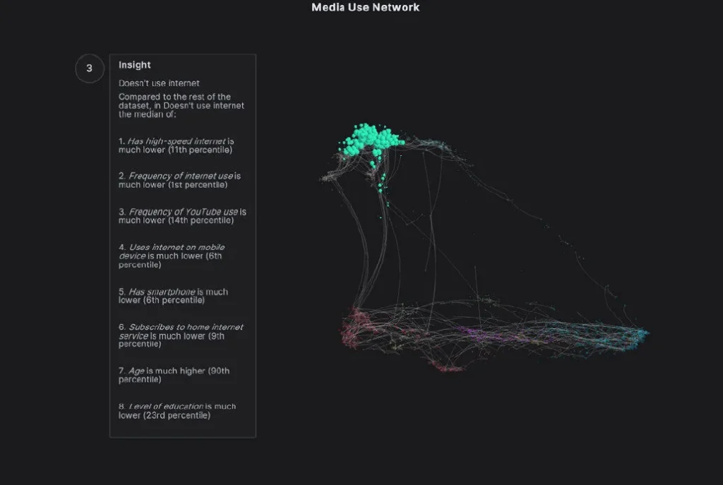
Using network graphs to explore talent retention
Before an organization can make meaningful changes to reduce turnover, they need to understand the kinds of employees most at risk of leaving. Are they managers? Young people? People who’ve been in a position too long? The number of things that could contribute to a person’s decision to leave can be high, and they can actually be occurring together. If you don’t know what those factors are, you can’t make systematic changes to stop turnover.
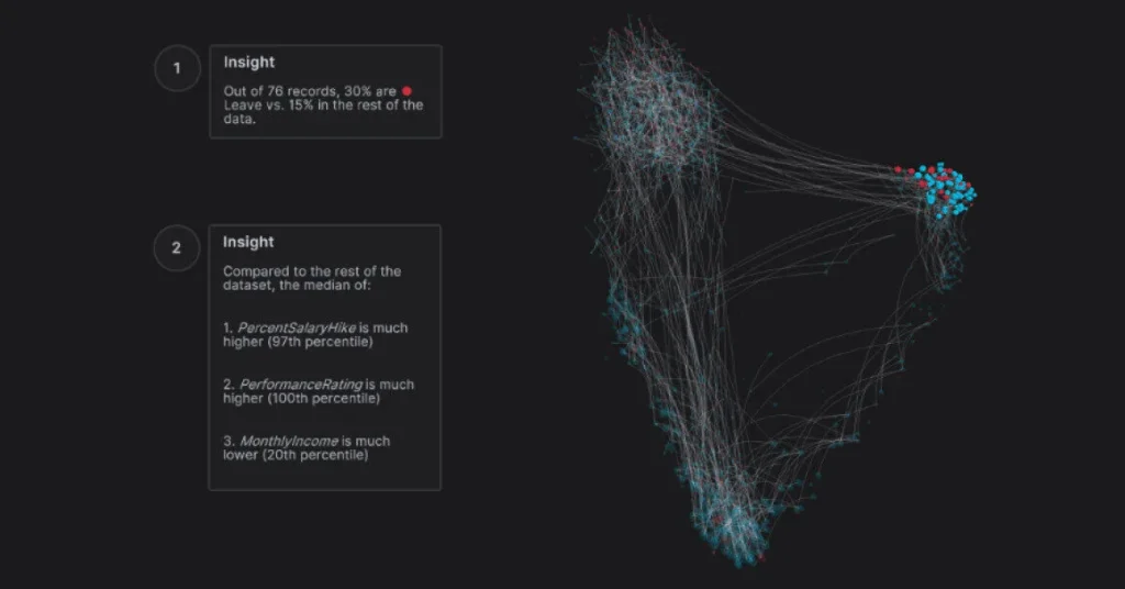
AI-generated 3D network graphs instead give decision makers a far more complete, multifaceted view of a problem, with the heavy-lifting all being automated. You can include any relevant factor in your analysis to create the most complete profiles of employees who have regretfully resigned. Armed with this information, you can:
- Create a profile of the most at-risk employees.
- Help HR determine when and how to intervene with stay conversations at an individual level.
- Identify systemic issues (say, turnover spikes in women in their early thirties, pointing to a need to provide more parental benefits).
This analysis goes far beyond Risk of Exit predictive metrics that only allow you to create best-guess personas. The combination of AI and network graphs provides high-level insights and explanations based on all of your data, not just simple numerical points.
How Virtualitics 3D network graphs make better sense of data
The power of network graphs is the ability to see all of the relationships underlying a business problem in their full complexity, identify the most valuable relationships, accurately understand the drivers of those connections, and use AI to discover all the what-ifs. Here are examples from several industries.
Manufacturing and energy
Transportation is the biggest contributor to US greenhouse gas emissions.2 A commercial airline planning for a future shift to sustainable aviation fuels (SAF) to reduce carbon emissions could use network graphs to explore many aspects of this very significant change.
They could model and compare the supply chains for all the biofuels that are in development: corn, other crops grown specifically for energy, oil seeds, algae, fats/oils/greases, agricultural and forestry residues, municipal solid waste, even wet wastes like manure and wastewater treatment sludge.
Or, network graphs and AI could be used to show how different mixes of the multiple types of biofuels used in SAF would impact emissions.
In turn, AI could help predict how shifting to different SAFs would impact seat pricing, both during initial adoption and into the future. The relationships between promising fuel formulations, increasing biofuels supply, reduced engine maintenance cost from cleaner fuels, and seat pricing could all be explored. Future state or federal government subsidy rules could be made part of an algorithm without lots of new coding.
80% of data and analytics innovations will be made using graph technology by 2025
Financial services
With network graphs, a bank could discover commonalities among communities of people who were pre-approved for credit cards but eventually defaulted. AI-guided exploration may reveal subgroups like those who selected electronics as a signup redemption reward, applicants aged 26 to 35, and those working part time within the overall community of defaults. Strong similarities between those who default get surfaced and explained, and analysts know that all aspects were considered without bias.
AI can then predict next steps to prevent further defaults, in clear language with explanations that validate the proposed actions.
Up to 25% of banking customers churn in the first year
Supply chains
Managing supply chains during an on-again, off-again pandemic is a significant business challenge. The relationships between interdependent parts can shift rapidly:
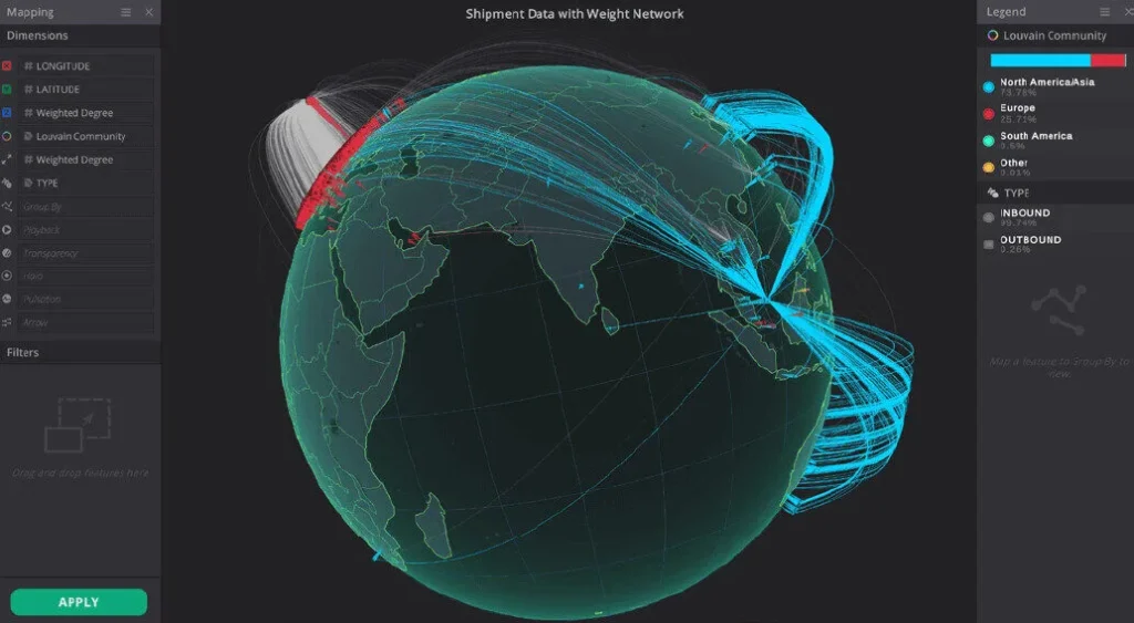
- Outbreaks cause labor force disruptions that ripple through regions.
- Resulting material production and shipping slowdowns gum up delivery times.
- Businesses change suppliers to more local sources.
A network graph of an e-commerce company managing perishables like Mother’s Day flowers would map nodes (growers, florists, glass vase and ribbon manufacturers, and delivery destinations) and edges (shippers, trucking companies, and home delivery services). Algorithms run against this model could show the impact of new scenarios, like a shift from South American to Mexican growers; changing volumes in the types of flowers imported and sold; temporary truck driver shortages due to regional virus outbreaks; and changes in glass availability.
Network graphs can show all these interdependencies, with AI predicting potential bottlenecks before they happen.
42% of one year’s earnings could be equal to supply chain disruptions losses every decade
Virtualitics’ network graph technology: a powerful engine for predictive and prescriptive AI
Virtualitics’ advanced analytics technology includes several innovations that are game changers when it comes to creating and utilizing network graphs to make data-driven business decisions.
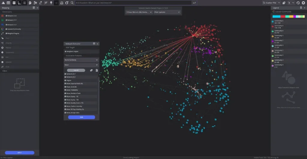
- Ability to easily graph all kinds of data. Most source systems export data into common, traditional data formats for storage. Virtualitics’ patented Network Extractor lets you create graph visualizations without having to transfer your data into a graph database.
- No/minimal data manipulation required. Network Extractor works out of the box for categorical and numerical data. Data stored in a network format (JSON file) requires no cleansing or manipulation before it can be graphed. With some preprocessing, the Network Extractor can also graph tabular data, the only option on the market with this capability. Unstructured data (text) can also be graphed through the data engineering capability in the Virtualitics AI Platform.
- Visualizations presented in 3D and/or VR. Communities with similarities and relationships within data are much easier to see and understand because our platform delivers them in 3D. Beyond the desktop, Virtualitics’ platform is also virtual reality (VR) enabled, delivering an immersive experience of data that is ideal for collaboration. Visualizations aren’t just fun to look at; it’s been proven that our cognitive ability to process and retain information is greatly improved when we use clear visuals to share information.
- Powerful processing capacity. Several million nodes can be processed and represented in a single graph. It’s possible to visualize and explain not just two or three categorical variables at the same time, but 10 or 20.
- Faster renders. Our technology can extract a network from an unformatted table faster than competing solutions can do this from a formatted table, an estimated 100X times faster. There is little waiting around for data to be rendered into usable graphs.
- Accessible, explainable AI. Our AI platform autonomously provides explanations of what’s going on, so users and leadership teams can feel confident in their analysis. It autonomously finds networks and the communities within them, describes the communities, and generates insights. More people, including those new to graphs, can make use of organizational data.
- No coding necessary. Many new sources of data can be layered into a network graph without requiring the skills of a data scientist or engineer.
See how you can use Virtualitics for AI-generated network graphs.
Virtualitics is a 2022 Gartner® Cool Vendor for Analytics and Data Science, recognized for developing technologies/products that enable users to do things they couldn’t do before, that anticipate market direction and need, and that have or will have business impact. We help organizations that want to “sift through big data to investigate complex systems with out-of-the-box machine learning.”
Request a free demo to see our self-serve data exploration solution in action.