Data is everything in today’s business environment. The problem is there is just so much of it. Every application we use, every interaction we have, and every system we access generates and consumes data.
The information held within this data can be used to drive business decisions, improve performance, and increase efficiency, but before we can extract value from the data, we first have to understand what it is telling us.
In today’s era of Big Data, it’s almost impossible to draw out the relevant insights using traditional data analytics. In order to make the data useful and actionable, many organizations are turning to artificial intelligence (AI) routines and machine learning technology to power their analytics.
The Role of Artificial Intelligence and Machine Learning in Data Analytics
Traditional data analytics involves a group of very specialized data scientists spending days, weeks, or even months examining and manipulating data, looking for patterns and relationships that can be used for business intelligence.
The process is tedious and time-consuming, and often not very effective. With the introduction of artificial intelligence (AI), organizations can analyze exponentially larger volumes of data in a fraction of the time, with far less intervention from skilled data experts required.
Machine learning (ML), a subcategory of AI, applies algorithms to structured and unstructured data looking for interrelationships, anomalies, and trends. AI routines and multi-dimensional visualizations are then used to render the results in a format that is highly understandable by anyone.
This “AI understandability” and visual modeling is crucial in today’s enterprises. Many of the key stakeholders and decision-makers who rely on the data insights are non-technical professionals, such as C-level executives, marketing directors, facility operators, and fleet maintenance managers.
Common Challenges of Adopting Artificial Intelligence and Machine Learning
Although there are many benefits to implementing AI and machine learning solutions to assist with data analytics, there are also inherent challenges. Here are four common roadblocks organizations encounter when taking on AI and ML adoption:
1. Legacy Systems
Data analytics has become a business imperative in essentially every industry. However, not all of these industries have kept pace with technological advances.
Organizations that operate with a significant number of legacy systems in place will encounter integration and compatibility issues with current AI platforms. Older technologies use different programming languages, frameworks, and configurations that simply don’t play well with today’s flexible cloud- and IoT-driven solutions.
To alleviate some of these issues, consider modernizing legacy systems prior to investing in AI and ML analytics tools, to help ensure all systems are compatible and integrate easily.
2. Data Quality
We’ve all heard the adage, “Garbage in, garbage out.” Machine learning models don’t know the difference between good and bad data. Machine learning precedent is set using whatever data you tell it to use. If that data is inaccurate, out of date, or otherwise poor quality, your analytics will not yield good results.
To increase the quality of your machine learning training dataset, employ a human to do a thorough review of the training data to ensure it is clean, complete, and consistent.
3. Knowledge Gaps
Although some AI-driven data analytics solutions are designed for a broader audience, every organization needs access to knowledgeable data scientists and analysts. However, as with most technical roles today, there is a significant lack of trained machine learning professionals actively looking for work. In fact, the shortage is so severe that a recent RELX survey found that 39 percent of respondents aren’t using AI because they don’t have the technical expertise to do so.
Organizations that are unable to staff needed analytics and data professional positions can partner with a managed services provider on projects that require a higher level of technical expertise.
4. Siloed Operational Knowledge
In manufacturing and utilities, facilities data is often siloed by department, which makes identifying interrelationships among data sources difficult. Without access to all datasets, both structured and unstructured, AI and machine learning capabilities are inefficient and won’t generate actionable insights.
Creating a “single pane of glass” for data analytics enables AI routines to provide full visibility into which variables are having the biggest impact on the target data. In turn, this allows data, operations, and maintenance teams to work together on a holistic solution to performance issues.
Tactics to Overcome Obstacles to Machine Learning and AI Adoption
Take the next step in supercharging your data analytics by implementing machine learning and AI solutions. Watch this on-demand webinar, ML Model Explainability Using 3D Visualizations, to:
- Gain a deeper understanding of your machine learning models
- Discover use cases for business analysts who need to utilize 3D visualizations to explore complex models
- See how using Virtualitics API enables data scientists to fit our 3D visualizations into their existing process when it comes to creating and refining models
The fourth industrial revolution (Industry 4.0) is well underway, as traditional manufacturing and industrial practices are increasingly augmented with “smart” technology to automate processes, monitor performance, and diagnose issues.
The sensors within these connected systems generate vast amounts of data across a countless number of variables. With the right analysis tools, this data can be used to drive efficiencies, reduce downtime, minimize unscheduled maintenance, and save the business time and money.
Industry 4.0 Data Analytics Challenges
The process of integrating high-tech monitoring and analytics into these complex industrial and manufacturing environments is not without its challenges.
Although some of the data analytics obstacles found in Industry 4.0 are a natural part of integrating new technology into established systems and processes, others are more fundamental in nature.
Siloed Operational Knowledge
In a manufacturing setting, knowledge is often siloed by department, with little visibility between groups. When there is a performance problem, equipment operators, manufacturers, field technicians, and maintenance workers all may have a piece of the information needed to solve the problem. But with no way to explore the relationships between the pieces, getting to the root cause of an issue is a slow and inefficient process.
Difficulty of Extracting Meaningful Insight from Large Amounts of Data
The data gathered in industrial and manufacturing settings comes from many different sources, which makes it extremely difficult to find connections between how data derived from one component impacts the data from a seemingly unrelated operation. To further exacerbate the problem, data may also be structured or unstructured, making identifying interrelationships even more complicated.
Skilled Worker Shortage
The lack of skilled technology and data science workers isn’t an Industry 4.0-specific challenge, but with more types of enterprises now relying on technology and data to run their businesses than ever before, the issue is reaching critical mass. In fact, a recent Gartner survey found that IT executives rate lack of technology talent as the most significant adoption barrier to 64 percent of emerging technologies. That’s a huge increase from the 4 percent reported in 2020.
How AI and Multi-Dimensional Data Visualization Help Solve Industry 4.0 Data Analytics Challenges
In today’s data-fueled industrial and manufacturing environments, connecting the dots between disparate data sources and using that information to drive action is critical. As Industry 4.0 continues to mature, data analytics must evolve to ensure enterprises realize the full potential of their embedded technology investments.
Flat, two-dimensional data representations can’t provide the level of insight needed to close information gaps and drive decision making. Artificial intelligence and multi-dimensional visualization tools are essential elements in this new industrial revolution. Together, these technologies provide deep visibility into interrelationships that isn’t possible with traditional analytics and visualizations.
Multi-Dimensional Visualization
Multi-dimensional visualizations enable analysts and stakeholders to find the “whys” behind the data. Knowing why equipment is behaving a certain way or why a sensor alert is frequently triggered helps teams maximize system performance, find the root cause of chronic issues, and take a proactive approach to preventing system failures and downtime.
In manufacturing and industrial services, data-driven decision-making is the most impactful; however, many mission-critical decisions are made by non-technical stakeholders. Data visualization takes complex, multi-sourced information and translates it into a visual model that is easily understood by data scientists and the C-suite alike.
For example, applying AI routines in conjunction with data visualizations enables analysts to identify which variables in a dataset have the greatest impact on the target variable. Using this information, the data analytics application can recommend the most appropriate visualization to interpret and explain why the findings are significant and provide easy-to-understand insight or validation around an issue.
Predictive Analytics
One of the most valuable outcomes of Industry 4.0 is the ability to predict and proactively address system and component failures that lead to lost productivity and revenue.
Predictive modeling leverages machine learning and AI-driven pattern recognition processes to quickly identify anomalies and trends within the data.
For example, predictive models can take both structured and unstructured data from disparate sources and determine which parts or systems are most likely to fail within a given period of time. This information is then integrated into maintenance workflows and systems, which ensures the at-risk components are inspected and replaced before a failure causes any downtime.
What’s Next for Industry 4.0 Data Analytics?
Looking ahead to the widespread rollout of technologies like 5G and the growing adoption of IoT in manufacturing and other industrial applications, it’s impossible to predict where Industry 4.0 will end and the next technology era will begin. However, we can be sure that data will play an even larger role in business and industry in both the short and long term.
As the volume of data continues to grow, analytics capabilities will have to keep pace to ensure the data can be used to provide value and insights to drive decision-making and process and performance improvements.
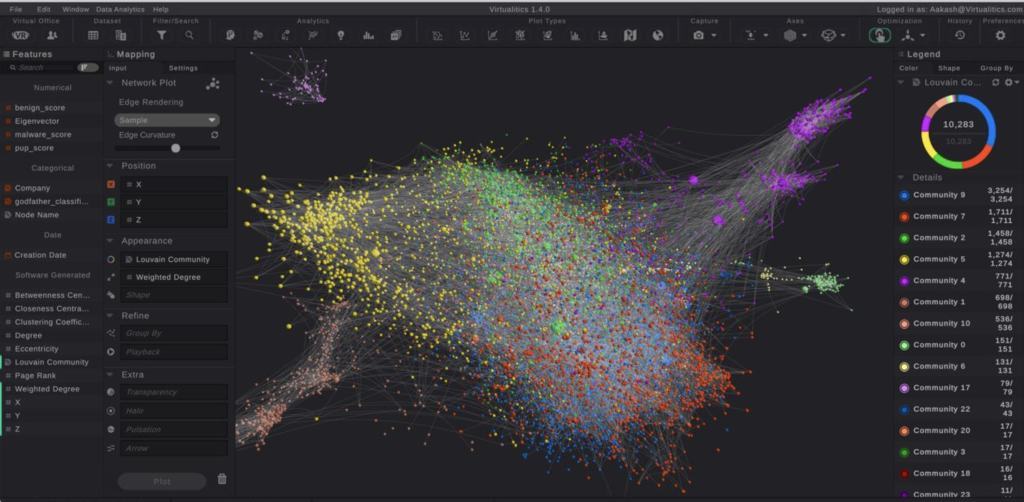
Network graphs, also known as knowledge graphs, can help determine connections between entities. They offer a way to depict things and the relationships between them.
These graphs represent a collection of interlinked entities organized into contexts via linking and semantic metadata. They build a framework for data integration and analysis.
Having the ability to do this can provide more context around metrics recorded from a network system. By leveraging these graphs, you can enhance your understanding of the data. As a result, you could gain a competitive edge.
Networks Are Everywhere
If you consider the common notion of networks, you’ll realize they are everywhere, both in the virtual and real worlds. The internet is just an extensive network of computing devices. Road systems are also networks in how they intersect with one another.
On smaller scales, businesses all have networks of data. By leveraging only standard business intelligence approaches, you only see the metrics; network or knowledge graphs open up the possibility of deeper analysis.
The Main Components
Knowledge or network graphs consist of three main components—nodes, edges, and edge weight. Let’s define each.
It’s All About Nodes
In the network or knowledge graph, nodes represent a wide array of things, from the tangible, such as people, places, and things, to the abstract, such as ideas, concepts, or topics.
Edges Illustrate Relationships
If nodes have a relationship, then this appears as an edge. The edge can define the specific relationship, depending on your data set. For example, you could have a group of nodes that represent people; the edges between could be their relation to one another.
Edge Weights Signify the Strength of the Relationship
Each edge will be different among your nodes. The strength of that relationship between nodes is the edge weight.
How Do You Define These Weights?
There are four types of weights possible in defining relationships:
- Undirected and unweighted: Signifies there is a connection, but it has no direction or weight
- Undirected and weighted: Demonstrates a connection, and the weight is the “number” of connections
- Directed and unweighted: Indicates there is no weight to the connection; it’s just connected or not
- Directed and weighted: Denotes that there is a strong connection, and it has a definable weight
How Do Knowledge or Network Graphs Work?
These graphs usually include datasets from many sources. Those can, of course, vary in structure. To drive consistency in form, the use of schemas provides a framework. Identities then classify the nodes. The third part is context, which determines the setting in which that information exists, which is useful when data points have multiple meanings (e.g., Apple versus apple).
Most knowledge or network graphs leverage machine learning (ML) and natural language processing (NLP) to comprehensively view nodes, edges, and edge weights via semantic enrichment. This is a process that, when data is ingested, allows the graphs to identify individual objects and their relationship to one another. Next, there is usually comparison and integration with other datasets that are relevant or similar.
Why Use Network Graphs?
In theory, networks can be very basic and simple with nodes and edges. However, the more nodes added to the network, the more complicated the graph will be. As a result, scaling of large networks can be challenging for interpretation or analysis.
Some use cases for network graphs include:
- Retail: Knowledge graphs can drive intelligence around upselling and cross-selling strategies, product recommendations based on past buyer behavior, and purchase trends specific to demographics.
- Finance: Banks often use these for anti-money laundering initiatives. They can serve as a preventative measure against crime and prompt investigations. They can watch the flow of money across customers to identify noncompliance.
- Healthcare: Medical researchers use knowledge or network graphs to organize and categorize relationships. It can support diagnosis validation and determine the best treatment plans on an individual basis.
In these situations, obtaining insight can be challenging, which is where network visualization and software come into the picture.
The Power of Network Visualization
By loading networks into software, you can visually view the data without the need for user input. You can then receive automated and interactive insights in one click.
If you want to analyze the data set further, you can leverage AI tools in network analytics. Drill down into the data and highlight what matters via filter, search, or interactive legends. This functionality is possible through the Virtualistics Immersive Platform (VIP), a patented data-driven data analytics and 3D visualization platform that’s easy for anyone to use.
Data can be a valuable, powerful asset for organizations. However, its proliferation and complexities don’t always drive actionable insights. The more robust your data set is, the harder it is to analyze with traditional methods. Multidimensional data describes such a data set in a way that allows you to look at it beyond traditional two-dimensional structures.
It can help you uncover critical information that leads to better business decision-making.
Multidimensional Data Defined
Multidimensional data is a data set with many different columns, also called features or attributes. The more columns in the data set, the more likely you are to discover hidden insights. In this case, two-dimensional analysis falls flat.
Think of this data as being in a cube on multiple planes. It organizes the many attributes and enables users to dig deeper into probable trends or patterns. You can interrogate queries rather than just submit them, as practiced in relational databases. It’s a comparatively fast exercise, manipulating the different dimensions and perspectives by attribute.

What Are the Advantages of Multidimensional Data?
In simple terms, lots of dimensions deliver lots of information. As a result, the potential for insight increases. In working with this type of data model, you can realize many benefits, including the following:
- Group similar information: All like information combines into a single dimension. This process keeps things organized and makes it easy to view and compare.
- Visualize the output of complex data: When working with this model in a platform, you can visually recognize the outcomes of data analysis.
- Identify patterns, trends, outliers, and anomalies: There are no hidden data points in this “cubed” data visualization. You have everything grouped and organized, so you can more easily recognize the insights. You’ll be able to build interactive reports for these elements.
- Examine relationships among data from multiple sources: You can add many layers of source data to build your cube and discover patterns.
- Improve collaboration and analysis across geographic locations: By using this model, you can more easily work with users with tools in a shared virtual office. It’s secure and allows people from different locations to work on the data at the same time.
- Extract valuable information from unstructured data: Unstructured data can be a pain point in analysis, but it’s no longer an issue with multidimensional data tools.
- Add “explainability” for non-data scientist stakeholders: Explaining data in an approachable manner is critical to driving better decision-making across the enterprise. Multidimensional data makes this possible.
- Compare the impact of changes to variables on the target data easily: If you want to understand the effect of change on specific data, you can with little strain.
- Process data quickly: You’ll gain speed with multidimensional data versus a relational database. The setup may be longer, but in the end, your processing will be faster.
- Maintain it with little work: Because you’re storing data in the same way it’s viewed, maintenance is simple.
- Save money: Multidimensional data models perform better and are more cost-effective than relational ones.
What Are Multidimensional Data Uses Cases?
When should your business leverage multidimensional data? Let’s look at a few use cases.
Improving Target Marketing
Every marketer wants to personalize communication and offerings to specific customers based on a host of data sets. Those may include demographics, consumer behavior trends, and detailed information about a customer’s past interactions with your brand.
With all these attributes, it can be challenging to see correlations. With multidimensional data models, you see the complete picture, which can lead you to conclusions. For example, you may find that time of day influences how big an order is, which may influence when you send out email offers.
Increasing Uptime with Predictive Maintenance
Predicting when equipment needs maintenance before it breaks or fails is key to minimizing downtime. Maintenance indicators vary widely depending on the complexity of the machinery. The data required to develop predictive maintenance strategies include maintenance logs, sensor data (if applicable), and other historical third-party data such as weather.
A great example of this is predictive maintenance for airplanes. These are sophisticated, expensive machines that have specific requirements for maintenance. In a case study on aviation, you can see how our technology used multiple data sources to build a multidimensional data model that helped predict what parts would require service.
Analyzing Complex Biological Data
Multiomics is another use case for multidimensional data. The data sets are all “omes”—genome, proteome, microbiome, and so on—related to health and disease analysis. As you can see, there are many features of the data, and it’s very complex. In traditional databases, there are limitations for researchers because they can only isolate single data points.
The key is the integration of data, which is difficult. This data model can support this process. Such a configuration allows researchers to understand public health better and discern correlations that fill current gaps in knowledge.
Experience the Power of Multidimensional Data
Watch the on-demand webinar “Machine Learning Model Explainability Using 3D Visualizations” to learn how machine learning-driven three-dimensional visualizations unleash the power of your data and drive more insights beyond two-dimensional views.
Ready to learn more?
Join us for a quick demo of our Intelligent Exploration capabilities and see how Virtualitics helps you explore your multidimensional data.
Data security experts predict that by 2025, the world will store 200 zettabytes of data. This estimate could increase significantly based on the data explosion driven by changes in user behavior during the COVID-19 crisis and businesses’ rush to jump-start digital transformation initiatives.
Today’s enterprises rely on this data to derive actionable insights that enable smarter, more targeted business decisions. But there are a few factors, including the high volume, that make it difficult to extract reliable, usable information from the data.
Common Data Analytics Challenges
Vast Quantities of Data
As mentioned above, users are generating historically high volumes of data each day. For organizations that need to use this data for business processes, a traditional approach to data management and analysis is inefficient at best.
Disparate Data Sources
Your organization is constantly generating and consuming data—whether it’s from an email opt-in form or a wind turbine speed sensor. Although much of the data you collect is valuable, some of it isn’t, and all of it needs to be analyzed to determine which camp it belongs in.
Unstructured Data
Unstructured data is the most difficult data to extract information from, but the insights it provides can be extremely valuable if you have the right analytics capabilities.
Data Automation Is Essential for Today’s Complex Data
The volume and complexity of today’s data make manual, human-powered approaches to data analysis impossible. The human brain simply isn’t capable of recognizing patterns, trends, and anomalies in data as thoroughly and efficiently as technology can.
Data automation takes traditional analytics capabilities and integrates computer systems, analytics software, and artificial intelligence to analyze huge datasets from disparate sources with minimal human intervention.
The insights made available through data automation enable several key businesses improvements, including:
- Driving business growth
- Identifying critical business insights and trends
- Reducing costs by identifying unknown bottlenecks, inadvertent errors, and constraints
- Improving decision-making
- Increasing productivity
Data Automation Improves Insights and Helps You Understand Data in a New Way
Traditional data analytics tools are limited in the depth and breadth of the information they can convey. Data automation allows users to explore their data at every level, from every angle, in near-real time.
Here are four ways data automation can be used to add maximum value to your data analytics:
1. Identify interconnections.
Data automation solutions that use multidimensional visualization instead of the traditional two-dimensional make it easier to understand interconnections between complex data. For example, adding a third plane to the visualization allows the user to compare the impact of two variables on the target data.
2. Accelerate analytics.
Data automation speeds up the analysis process by taking time-consuming, complex tasks out of the hands of humans and letting technology do the heavy lifting. This not only speeds up the data analysis but also improves the results because there is less chance of human error.
3. Identify key insights, outliers, and anomalies.
Traditional data analysis tools take a flat view of the data, which makes it difficult to see the complete picture. Data automation tools can view and display data in a variety of visualizations to provide a multidimensional view that quickly exposes data relationships, patterns, and unexpected results.
4. Predict the future.
Data automation can pull in data from a variety of sources and find insights and patterns from all forms of data. Leveraging predictive modeling, this data can be used to proactively plan for future events.
Data Automation in Action
In the wild, data automation can be applied to a wide variety of use cases. For example, an aircraft fleet maintenance team can analyze data from maintenance and repair records, sensors, and flight logs to determine which components are most likely to break down and when.
The system can then be automated to trigger routine maintenance to prevent the at-risk components from failing, as well as syncing with the inventory system to ensure the failure-prone parts are always available.
COVID-19 isn’t the only driver behind the current data explosion, but because of many changes brought about by the pandemic, the trend is unlikely to slow down anytime soon.
Enterprises depend on data for most business processes and initiatives, so it is crucial to find ways to extract the most value from the flood of data in a way that is both fast and cost-effective.
Data automation helps businesses streamline data analysis processes and generate robust analytics that provide a much more complete and in-depth view of the information hiding in today’s complex datasets.
Lung cancer is the leading cause of cancer-related death, making up almost 25 percent of deaths from all types of cancer in the U.S. However, thanks to positive lifestyle changes such as quitting smoking and advances in research, detection, and treatments, that number is dropping.
Individuals with cancer are at greater risk of developing complications and dying from common illnesses and viruses, including influenza. So, when a research group from Columbia Medical School launched a study to explore the link between lung cancer mortality and flu epidemics, Virtualitics joined the team to provide state-of-the-art data analytics and multidimensional visualization capabilities.
The purpose of this study was first to determine whether a link existed between death from lung cancer and influenza and then to apply any significant findings to increase patient and provider awareness of the danger of influenza infection for patients with lung cancer.
How the Study Was Conducted
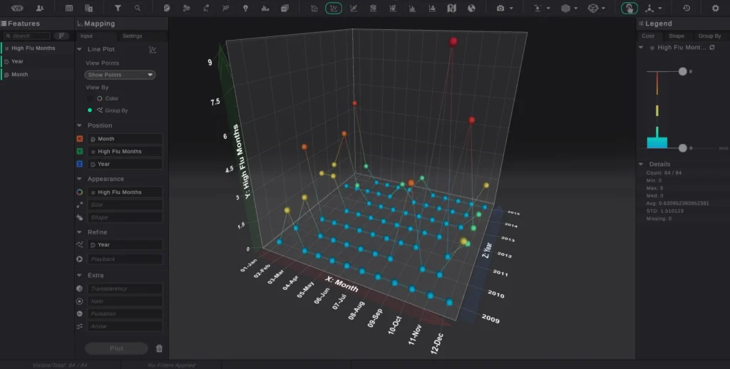
The study was conducted using 195,038 patients with non-small cell lung cancer (NSCLC) located across 13 states using data obtained from the Surveillance, Epidemiology, and End Results (SEER) Program and the Centers for Disease Control and Prevention (CDC).
The research team compared monthly mortality rates during the high and low flu months between 2009 and 2015 for all at-risk patients in the study, as well as newly diagnosed patients. Influenza severity level was defined based on the percentage of outpatient visits to healthcare providers for influenza-like illness and matching CDC flu activity levels with SEER data by state and month.
The data was then analyzed using high-dimensional visualization coupled with AI routines so researchers could fully understand and explore the complex relationships within the data.
What the Study Found
The research team observed a significant difference between the monthly mortality rate in patients during high flu months compared with low flu months.
The positive relationship between flu severity and mortality was observed across all study participants, as well as at the individual state level and among new patients, specifically.
The results of the study, which were published in the Journal of Clinical Oncology, proved that increased influenza severity was positively associated with higher mortality rates for NSCLC patients. At the conclusion of the study, researchers indicated that the study’s findings support the need for future research to determine the impact of influenza vaccines on reduced mortality for patients with lung cancer.
3D Visualization and AI-Driven Analytics Enable Research Teams to Get the Most Valuable Information from Data
The Columbia Medical School research team was able to determine that a correlation exists between influenza severity and patient mortality by using three-dimensional visualization and artificial intelligence to analyze and model data. This type of visualization has several key benefits that improve data analysis capabilities across not just research but all industries.
Increase Visibility
Unlike 2D models, multidimensional visualization allows researchers to add and remove variables to measure the impact on the subject and get deeper and more complete insight into the relationships between datasets. For example, during the lung cancer study, researchers examined flu severity level by month and year simultaneously.
Identify Interrelationships
Immersive data analytic technology is essential for identifying patterns, trends, and outliers that researchers can easily miss when the data is only presented in two dimensions. Without the additional plane, critical data points may be occluded that could make a significant difference in a study’s results.
Three-dimensional visualizations can also be applied to unstructured data to enable research teams to gain valuable insight and identify relationships that exist between datasets from otherwise hard-to-analyze, disparate data sources.
Improve Communication
Applying multidimensional visualizations to complex AI and machine learning models allows researchers to display data relationships in a variety of geospatial and graphical visualizations that are easily understood by researchers, data scientists, and the non-scientific community alike.
AI-driven data analytics and 3D visualization tools also enable distributed research teams to collaborate over geographic locations. With collaboration and presentation tools available in both desktop and VR, researchers can work together securely to find, visualize, and share data insights, anomalies, and patterns, no matter where they are located.
Multidimensional visualization paired with the power of AI and machine learning is driving advances in healthcare and medicine. When the Columbia Medical School research team and Virtualitics partnered to tackle the world’s deadliest cancer, they were able to look at the data in a whole new way.
Contact us to learn how Virtualitics AI Platform can help your organization get the most information and value from your data.
Detailed paper:
Influenza and mortality for non-small cell lung cancer. Authors: Connor J Kinslow, Yuankun Wang, Yi Liu, Konstantin M. Zuev, Tony J. C. Wang, Ciro Donalek, Michael Amori, and Simon Cheng. Published on Journal of Clinical Oncology, Volume 37, Issue 15.
Data is a valuable commodity in today’s information-driven business environment. But, unlike currency or other assets, data’s real value is in the actionable insight you extract from it.
Data analytics has become much more challenging in recent years with the volume of data being generated skyrocketing to trillions of rows per day, much of it unstructured. To further complicate matters, data is delivered from many different sources, which creates multidimensional data sets that must be carefully analyzed to identify patterns and interrelationships among the disparate data types.
The Role of Visualization in Data Analytics
The human brain does many things well, but scaling isn’t one of them. To help simplify analysis and maximize value from high volumes of increasingly complex data, more organizations are relying on data visualization technology to make sense of it all.
Data visualization—which, at a high level, is simply the visual representation of information—drives data analysis by removing the noise and presenting data in a way that is easily internalized.
Unlike using a spreadsheet filled with numbers and no context, telling your data’s story in a visual form clearly highlights trends, patterns, and outliers within the data set so the most useful information is front and center.
This visual approach also adds “explainability” to complex concepts that non-data-scientists, such as product owners and management, need to drive decision-making and meet business objectives.
The Era of Immersive Data Virtualization
In today’s highly complex business environments, static visualization is no longer sufficient in the majority of use cases. Extracting the most valuable data insights requires multidimensional, immersive visualizations so users can really drill down and interact with the data, looking at it from every angle.
By expanding data analytics capabilities beyond static visualization and basic interactivity, immersive data virtualization provides AI-driven data analytics and 3D visualizations that let anyone in the organization—not just the data scientists—get fast, actionable insights from even the most complex data.
Immersive visualization platforms give data-centric organizations the ability to view data in a variety of geospatial, 3D, and graphical visualizations, which makes it easier to spot anomalies and patterns in the data and pull out important information and trends even from unstructured data.
Pain Points Solved with Immersive Data Visualization
Immersive data visualization creates highly informative yet easy-to-understand data representations that help organizations overcome several key business challenges:
Siloed Operational Knowledge
Immersive data visualization makes even the most complex data accessible to the masses. Non-data-scientists can generate and manipulate data representations themselves to extract business-critical knowledge that drives decision-making.
Collaboration Among Distributed Teams
Immersive data visualization platforms let teams share insights and collaborate on actionable information across the office or across the globe.
Missed Growth Opportunities
Immersive data visualization presents data clearly and concisely, making it easy to spot trends and anomalies that highlight areas for improved efficiency and opportunities for increased market share.
Finding the “Whys”
It isn’t always clear what is triggering sensor or system alerts, and this lack of clarity can result in alert fatigue and increase risk. Immersive data visualization lets users track alerts and visualize the data from multiple angles to pinpoint the root cause and quickly resolve issues.
Connecting the Dots Within Data Relationships
Enterprise data comes from a million different directions at once. Immersive data visualization takes these disparate data types and sources and creates a clear, cohesive picture of the data’s story across them all.
Immersive Data Visualization and the Human Element
The human brain is designed to navigate a 3D world, which is why we can grasp concepts such as the size of objects and relative distances between points.
Although static visualization techniques such as bar charts and 2D scatter points are somewhat useful for understanding data, today’s complex data sets demand multidimensional visualization and interaction.
Immersive data visualization technology allows users to create robust, collaborative environments where they can explore different dimensions of the data to tell a story everyone can understand and build on.
The FinTech Innovation Lab was co-founded by the Partnership Fund for New York City and Accenture in 2010.
Our time at the FinTech Lab was invaluable, helping us to hone our product to be a vital tool not only for financial services but for any company’s infrastructure. Watching this video is a great introduction to Virtualitics, but we agree with Ari Koban from BlackRock when he encourages “all of you to go after this, put a headset on and see what it has to offer, and experience what you can learn in this VR environment because it’s incredibly impressive!”.
Watch how our CEO, Michael Amori, addressed the audience on Demo Day in late June 2018 and shared all of this and more.